
The journal · Desk research
Traska Commuter 36: the quiet watch question
There is a difference between a watch you stop noticing and a watch you stop caring about.
Restraint is a choice
The Commuter 36 Carbon Black does not need a dramatic origin story to make sense. The dark dial, simple markers and steel bracelet offer an uncomplicated starting point. In the maker’s photographs, the interest comes from small changes in surface and proportion rather than a loud motif.
That can be exactly what an everyday watch needs. You may want something that survives a change of shirt, a meeting and a weekend without requiring you to curate the rest of your appearance around it. But “versatile” is not a substitute for attraction. If you only like this watch because nobody could object to it, keep looking.
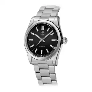
Choose the dial before comparing the movement
TRASKA’s listing covers date and no-date configurations. The maker specifies a Miyota 9039 for no-date and a 9015 for date. Decide which display you want before treating the product name as one fixed specification.
There is no moral victory in removing a date window. If you use it repeatedly, a clean dial can become a daily irritation. If you never use it, keeping the face uninterrupted may be the stronger design choice. Make the decision from habit rather than from a rule borrowed from somebody else’s collection. The accompanying photographs identify the date version where it is shown.
Hardening is a question worth asking about
TRASKA advertises a steel-hardening treatment and a hardness figure of 1,200 HV. It also says the bracelet receives the treatment. Those are manufacturer claims; we have not run an abrasion test or established how a particular watch will look after years of use.
Our interest is in the ownership question the claim raises. If a link is damaged, can it be replaced easily? What does the maker recommend when a treated surface needs attention? A scratch-resistant proposition is appealing to anyone whose desk has already marked a clasp. It should not be translated into permission to stop caring how the watch is used.
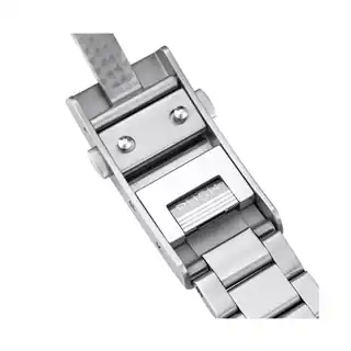
The bracelet deserves its own photograph
The listing describes a bracelet taper from 20mm to 16mm. The rear and clasp photographs help you see the physical construction instead of making you infer it from the dial shot. The adjustment mechanism is particularly worth checking against the exact generation being sold.
A pleasing taper does not prove comfort. The useful questions are practical: how small can this bracelet be sized, how are links removed, and what adjustment is available when your wrist changes during the day? A maker’s specification sheet may answer the first two. A return policy or an opportunity to handle the watch helps with the third.
A daily watch still has limits
The maker lists a screw-down crown and 100m water resistance. Follow its care instructions rather than turning the depth number into a story about activities we have not tested. The same restraint applies to reading the wrist photograph: it shows the watch in context, not how it will sit on your own wrist.
An everyday watch is a relationship between an object and a routine. Think about whether you wear gloves, lean on a desk, prefer loose bracelets or frequently change straps. Those are better prompts than trying to win a specification comparison against an imaginary average buyer.

The Sensei take
The Commuter makes a convincing research candidate for someone who wants a restrained automatic and is interested in its approach to steel and bracelet design. Its appeal is cumulative. No single photograph has to do a magic trick.
We would settle the date choice and ask about bracelet sizing and replacement links before buying. Pass if you want a watch that announces itself across a table, or if the purchase only makes sense when “scratch resistant” means “never marked.” Quiet can be a strong preference. It should still be your preference.