The maker
TRASKA watches
TRASKA gives clean sports-watch lines an additional material interest through hardened steel. Commuter and Chronograph make different expressions of that practical-minded identity.
The Sensei take
An everyday watch can still be the favourite.
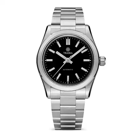
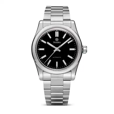
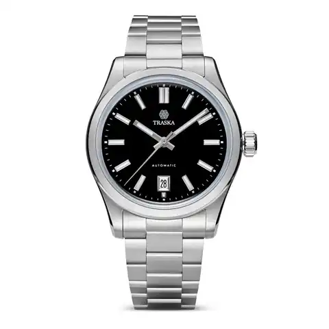
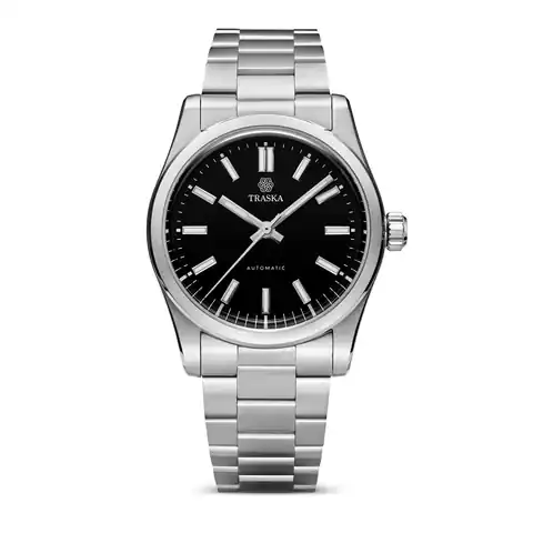
Commuter 36 Carbon Black keeps the dial decision clear: date or no date, with the corresponding Miyota movement underneath. Hardened steel adds another reason to be interested in TRASKA's everyday-watch approach.
The Chronograph Arctic White and Tungsten Gray introduce a more involved face. That gives the collection two satisfying roles: a restrained daily watch and something with more visual activity. TRASKA's strongest pitch is the possibility that the watch you reach for most often can still be the one you find most interesting.
What we love: practical interest with a proper design payoff
TRASKA's hardened steel gives the collection a material story, but the Commuter would still deserve a look for its face. The appeal is the clarity: markers, hands and dial colour arranged inside a restrained sports-watch outline. It leaves room for the colour to become a meaningful choice.
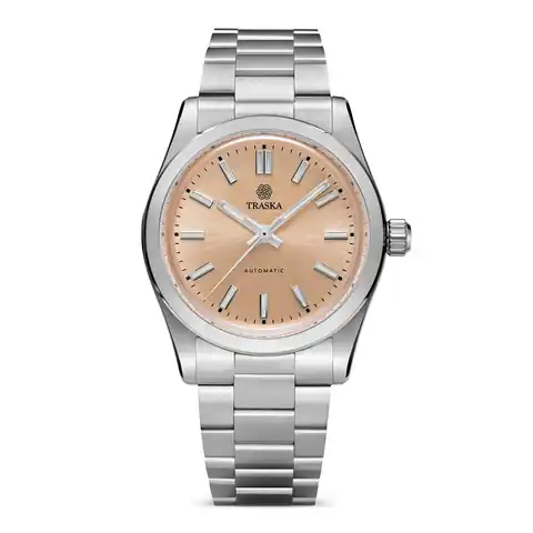
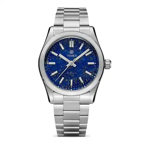
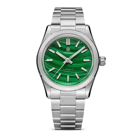
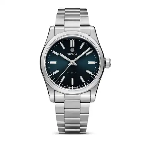
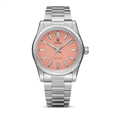
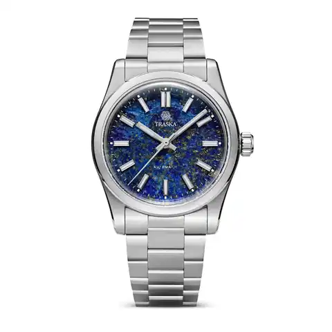
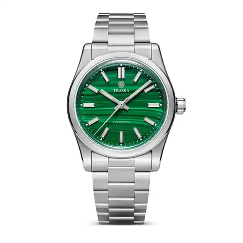
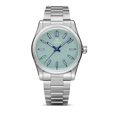
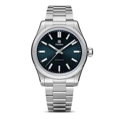
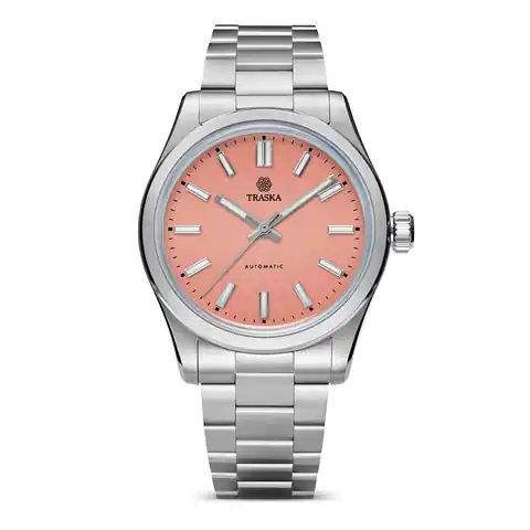
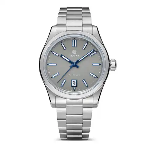
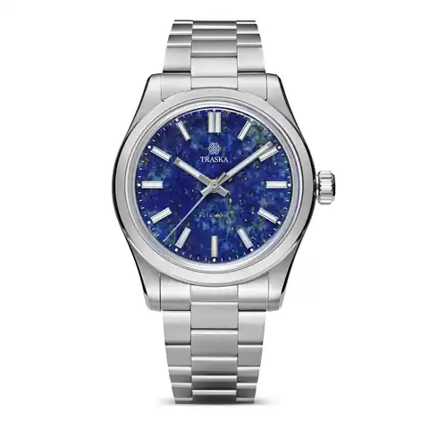
We particularly like the range of personalities that a simple dial can carry. Carbon Black makes the Commuter feel focused and understated. Adriatic Blue moves the same idea towards colour. Faded Copper, Florida Coral and Seafoam Green are names worth following when you want the dial to do more of the talking. In a relatively clean composition, those choices have somewhere to shine.
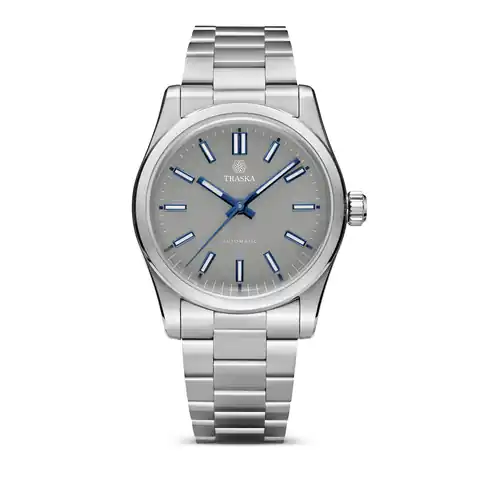
Then there is the Chronograph. Arctic White and Tungsten Gray give TRASKA another expression, with more activity across the face. That is a useful contrast within the brand: the calm daily-watch idea on one side and a more involved dial on the other. You can enjoy both without pretending they do the same job visually.
Who are TRASKA watches for?
The person who wants their everyday watch to be the one they are excited to put on. Some collectors have a spectacular special-occasion piece and a daily watch chosen almost by default. TRASKA is interesting territory if you want to care more about that everyday choice, down to the exact dial colour and the presence or absence of a date.
It also makes sense for someone whose taste leans towards clean steel sports watches but who enjoys a material detail beneath that familiar appearance. Hardened steel gives you something concrete to explore beyond a photograph, while the Commuter's restrained layout keeps the visual argument easy to understand.
We would particularly send colour-conscious minimalists here. If your wardrobe is mostly neutral, a dial can become a recurring accent rather than an occasional flourish. Blue, black and the more expressive Commuter colours let you decide how much of that accent you want.
Start with the Commuter 36 Carbon Black
This is our starting point for understanding the Commuter. The 36mm format and black dial put the emphasis on the shape, markers and overall arrangement. It is the version to compare first if you want the watch to sit comfortably within your visual style rather than introduce a new colour. From there, the date and no-date choices become part of deciding exactly how spare you like the face.
Give colour a chance: Commuter 36 Adriatic Blue
Adriatic Blue is the next tab we would open. Keeping the size and model family constant makes the effect of the colour easier to appreciate. Imagine the blue beside your usual shirts and jackets, then go back to Carbon Black. Which one makes the watch feel like a choice you would enjoy repeating? This is where the Commuter becomes personal.
For a busier face: Chronograph Arctic White
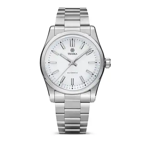
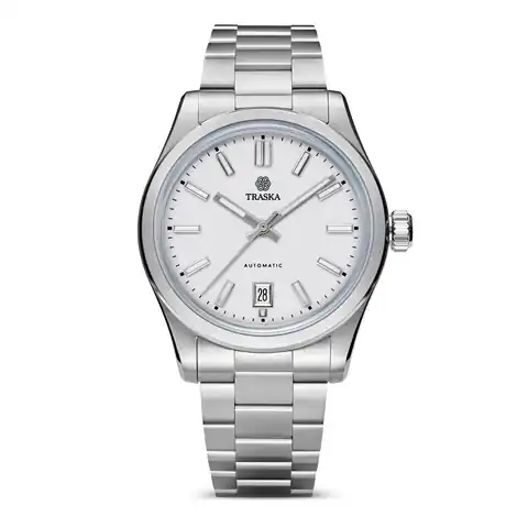
The Arctic White chronograph takes the conversation in another direction. A lighter dial and chronograph layout give the eye more to explore than the Commuter's simpler face. We would start here for someone whose attraction to watches includes the look of timing instruments. Tungsten Gray then becomes the comparison for deciding how much contrast and colour temperature you want in that more involved design.
How we would choose our first TRASKA
Begin with Commuter versus Chronograph. Decide whether you want an open, restrained face or the extra visual activity of a chronograph. Then choose proportion and colour within that direction. It keeps the interesting decisions visible instead of burying them in a long list of variants.
Our first choice would be Commuter 36, with Carbon Black and Adriatic Blue side by side for the final decision. The black is the quieter visual companion; the blue is the one we would pick to give a neutral wardrobe a recurring note of colour. Either is a more satisfying choice when you can explain exactly why you keep coming back to it.
A taste of TRASKA
The watches that make the case.
50 watches · showing 1–24
Start with the watches
Different watches. Different reasons to look.
TRASKA
Commuter 36 Carbon Black
A daily watch should survive the desk, too.
Get the Sensei take →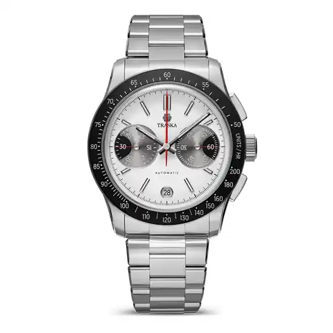
TRASKA
Chronograph Arctic White
Explore the watch →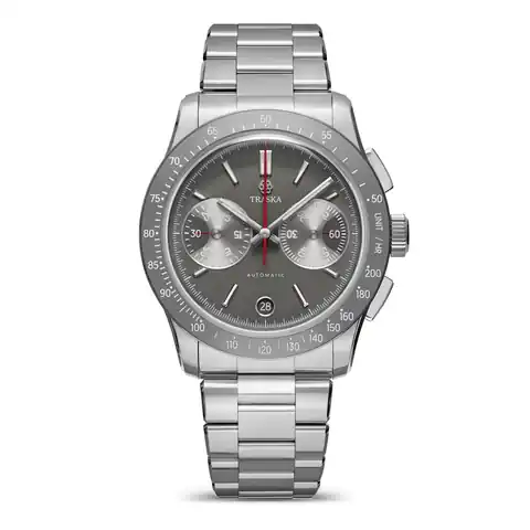
TRASKA
Chronograph Tungsten Gray
Explore the watch →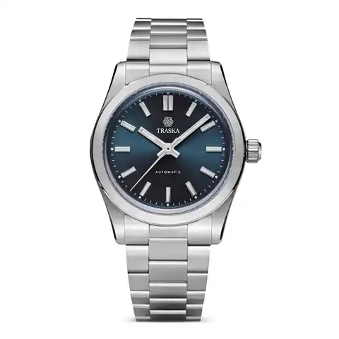
TRASKA
Commuter 34 Adriatic Blue
Explore the watch →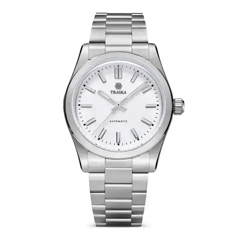
TRASKA
Commuter 34 Arctic White
Explore the watch →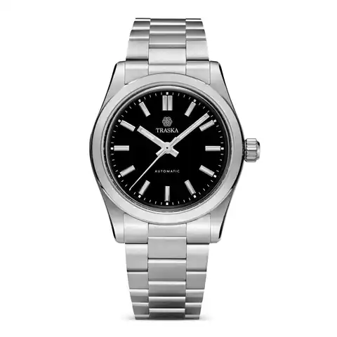
TRASKA